
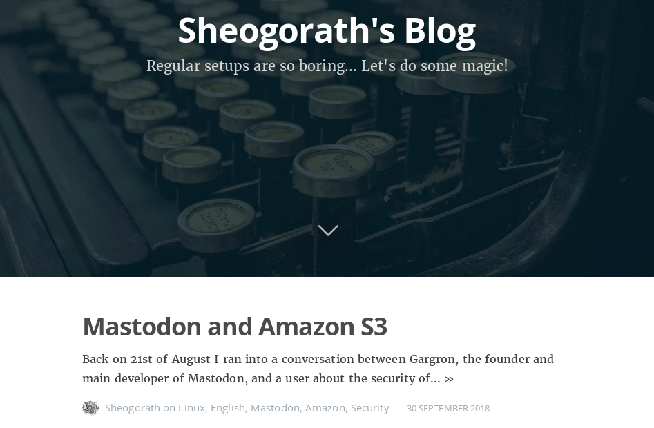
New Design
As you may notice my blog looks a bit different. In the past week I started to re-design the blog in various ways.
Of course starting with the design itself, but you may also notice that there are now more social icons for my profiles, while other profiles like the one from my co-author Alex are gone.
No matter what, his articles still exist. Instead, I added a notice that they are not written by myself and also a link to his blog.
The whole idea is to make the blog a bit more focused on me and my projects instead of being a collection of technical knowledge and stuff I and others wanted to share.
The redesign process itself was quite interesting and so I’ll share a few details.
Old design
If you don’t remember the old look, because you only visit this page from time to time, here is a screenshot from the old one:
It was mainly inspired by the software I used for this blog in the first place: Ghost.
So after switching to Jekyll since I was tired of updating the backend every few days, I decided to stay with a compatible theme.
This has changed now and this fresh look comes with some other benefits, like the structure of new posts is less complicated as it no longer mimes a CMS that it isn’t.
No way around jQuery
During the development of the new theme, which is basically an adaption of Jekyll-Uno, I tried to eliminate the need of jQuery.
First I switched from a Google hosted version to a locally served version. This improves privacy and security for my readers. But at the same time, it comes with the cost of some performance and bandwidth, especially on mobile devices.
A look into the main.js reveals that it’s not doing much. Mainly adding some classes that are then used for CSS. But there is one statement that is hard to replace:
$('.panel-cover').animate({'max-width': '530px', 'width': '40%'}, 400, swing = 'swing', function () {})
This statement, I thought, would be easy to replace with a CSS transition and then boils down to adding a class. Well, as it turns out, it’s not that easy. This animate is needed because we use max-width. When you try to use a width transition in combination with max-width the transition only happens within the range defined as max-width. Which is not really what I wanted to achieve. And so I decided to stay with it.
And also undid all my change to the class replacements, since I need jQuery anyway. (And I’m too lazy to disassemble jQuery to get only the needed functions out there).
Picture or no picture
Depending on the display size of your device you may see and cover picture for this article. The thing is, that I noticed that on the desktop version I felt like the cover picture is missing, while it’s a bit annoying on the mobile version. Also, I had cover pictures for most of my other articles and I didn’t want to lose them. So I added the needed HTML and some CSS and it works.
A problem I noticed was that with display: none; the picture was still loaded on mobile devices while probably never shown. That’s really a no-go for me and so I came up with a, I hope, a quite creative solution. I use HTML5 <picture> tags to use media query based image loading. And for the mobile version, I simply present a 1x1 pixel image that is transparent and has display: none; set.
<picture class="post-cover">
 <source srcset="https://my.tld/path/to/image.jpg" media="(min-width: 960px)">
 <img src="data:image/png;base64,iVBORw0KGgoAAAANSUhEUgAAAAEAAAABAQMAAAAl21bKAAAAA1BMVEX/TQBcNTh" alt="Cover image for this blog post">
</picture>
This saves, depending on the picture, around 200kb per page load on mobile devices. And the inline usage of the picture also prevents unneeded requests.
Fonts for Mastodon and GitLab
Jekyll-Uno ships the “foundation-icons”-fonts with it, but it lacks some icons I needed. So I decided to switch to the wonderful font-awesome fork “fork-awesome”, that I added use in CodiMD recently.
Once done, I only had to change a few details and everything was ready to go.
We need more favicons
Before I switched to the new blog theme, I wasn’t aware of the fact that there seems to be a standard that everyone has an own standard about what size and name they like for their favicon. I knew that once it was so dead simple to just have a favicon.ico in the root of your web server and it worked.
Well, seem to be no longer the case. You need a ton of favicon declarations, so everyone is able to find the right one.
To simplify the generation of them based on my profile picture I decided to just use ImageMagick’s convert command and a shell script that I ship with my repository now. Since I don’t expect myself to update my profile picture too often, I’ll stay with running it manually.
Anyway, all this is the reason why you can see my little profile picture in your browser. I hope, I don’t annoy you too much.
Summary
All in all, I hope the new design makes the blog a bit nicer and help people to follow and find me on all needed platforms. Also feel free to write me emails when you have questions or additions for articles. Or just follow me on Mastodon.
Finally, if you want to have a look into the full changeset, check out the diff on my GitLab instance I created for the new theme.
Hope you enjoy the new theme and see you soon!